Das folgende Objekt ist maskiert 'package:kableExtra':

    group_rows
Die folgenden Objekte sind maskiert von 'package:terra':

    intersect, union
Die folgenden Objekte sind maskiert von 'package:stats':

    filter, lag
Die folgenden Objekte sind maskiert von 'package:base':

    intersect, setdiff, setequal, union
library(rprojroot)library(patchwork)
Attache Paket: 'patchwork'
Das folgende Objekt ist maskiert 'package:terra':

    area
library(rmarkdown)library(tidyr)
Attache Paket: 'tidyr'
Das folgende Objekt ist maskiert 'package:terra':

    extract
library(tibble)
Data sets
In this tutorial we will work with a Sentinel-2 scene from 18/06/2022 from the National Park, Harz. We will also use the boundary of the National Park to define our study area. Before we can start you may download the S2 Scene from the following link: S2-download.
We also need to dowload the boundaries of the national park from the following link: National Park. Place both files into the subfolder ‘data’ of this tutorial.
# create a string containing the current working directorydata_dir=paste0(find_rstudio_root_file(),"/block1_magdon/data/")# Import the boundary of the national park as sf objectnp_boundary =st_transform(st_read(paste0(data_dir,"nlp-harz_aussengrenze.gpkg")),25832)
Reading layer `nlp-harz_aussengrenze' from data source
  `D:\EON2025\block1_magdon\data\nlp-harz_aussengrenze.gpkg'
  using driver `GPKG'
Simple feature collection with 1 feature and 3 fields
Geometry type: MULTIPOLYGON
Dimension:     XY
Bounding box:  xmin: 591196.6 ymin: 5725081 xmax: 619212.6 ymax: 5751232
Projected CRS: WGS 84 / UTM zone 32N
# Import the S2-Satellite image as terra objects2 <- terra::rast(paste0(data_dir,"S2B_MSIL2A_20220618T102559_N0400_R10_resampled_harz_np.tif"))names(s2)<-c("blue", "green", "red", "red_edge_1", "red_edge_2", "red_edge_3", 'nir1','nir2', 'swir_1')s2 <-terra::mask(s2,np_boundary)
Anaylsing the spectral variablity within the study area
If we have no access to prior information on our target variable in the study area we can use the spectral variability as a proxy for the variability of the target variable. By using the spectral variability as sampling criteria we also ensure, that we cover the spectral range with our sampling.
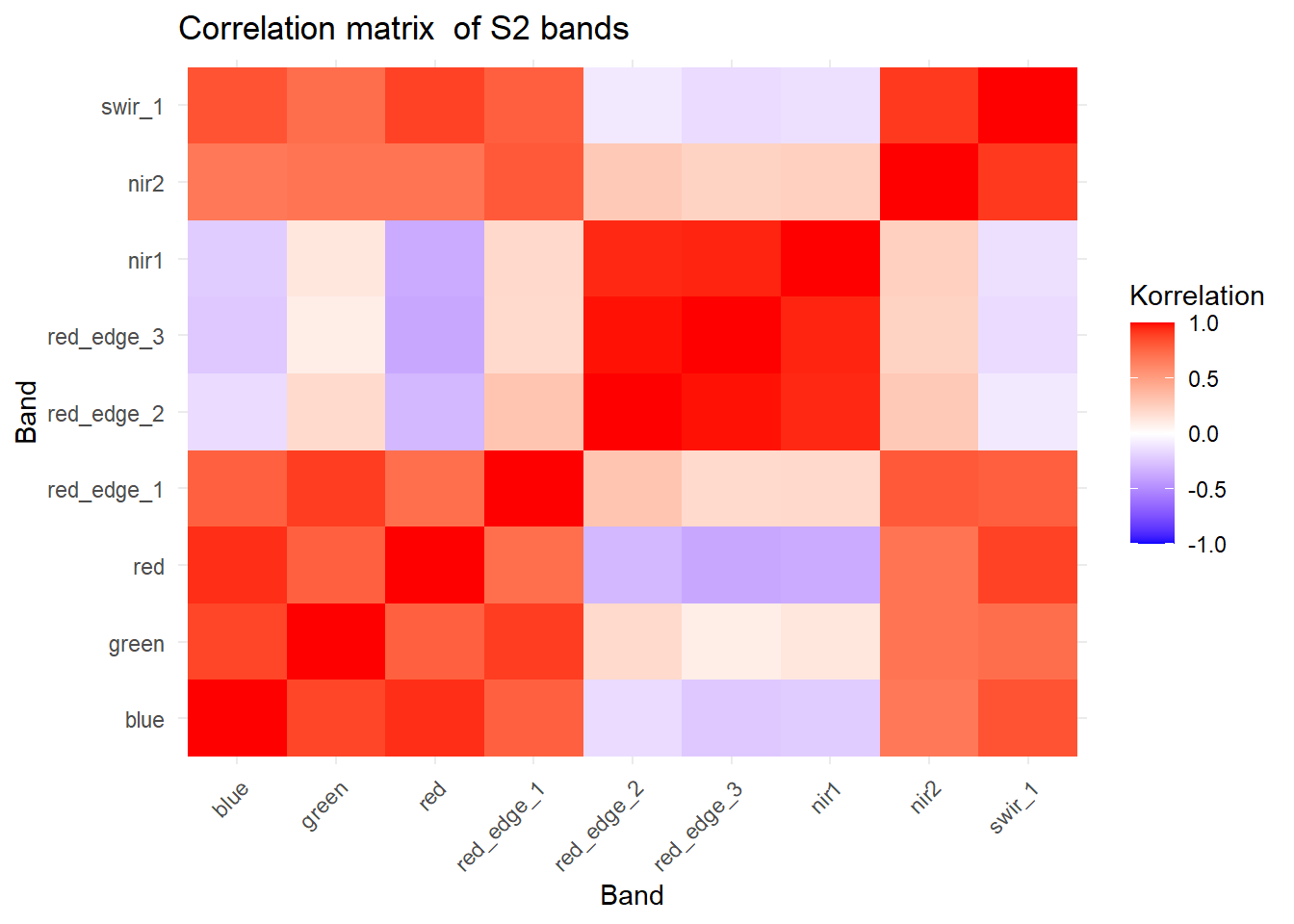
The imported S2 scene has nine spectral bands covering the electromagnetic spectrum from 490 nm (blue) to 1610 nm (swir_1). Due the the physical properties of electromagnetics we can expect that wavelength which are similar carry correlated information. To test this, we create a correation matrix of the nine spectral bands.
df <-as.data.frame(s2, na.rm =TRUE)df <-na.omit(df)# create correlation matrixcor_mat <-cor(df, use ="pairwise.complete.obs")cor_long <-as.data.frame(cor_mat) %>%rownames_to_column("Var1") %>%pivot_longer(-Var1, names_to ="Var2", values_to ="correlation")# make sure bands are orderd with increasing wavelengthband_names <-c("blue", "green", "red", "red_edge_1", "red_edge_2", "red_edge_3", 'nir1','nir2', 'swir_1')cor_long$Var1 <-factor(cor_long$Var1, levels = band_names)cor_long$Var2 <-factor(cor_long$Var2, levels = band_names)# correlation plotggplot(cor_long, aes(x = Var1, y = Var2, fill = correlation)) +geom_tile() +scale_fill_gradient2(low ="blue", high ="red", mid ="white",midpoint =0, limit =c(-1,1), space ="Lab",name="Korrelation") +theme_minimal() +labs(x ="Band", y ="Band", title ="Correlation matrix of S2 bands") +theme(axis.text.x =element_text(angle =45, vjust =1, hjust =1))
As expected, neighboring bands are highly correlated and thus carry redundant information.
Dimension reduction (PCA)
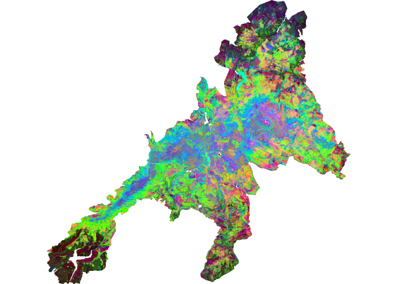
In a fist step we reduce the dimensions of the 9 Sentinel-2 bands while maintaining most of the information, using a principal component analysis (PCA).
# Calculation of the principlal components using the RStoolboxpca<-RStoolbox::rasterPCA(s2,nSamples =5000, spca=TRUE )
# Extracting the first three componentsrgb_raster <-subset(pca$map, 1:3)# Function to scale the pixel values to 0-255scale_fun <-function(x) {# Calculation of the 2% and 98% quantile q <-quantile(x, c(0.02, 0.98), na.rm =TRUE)# scaling the values x <- (x - q[1]) / (q[2] - q[1]) *255# restrict the values to 0-255 x <-pmin(pmax(x, 0), 255)return(x)}# Scaling of each bandfor (i in1:3) { rgb_raster[[i]] <-app(rgb_raster[[i]], scale_fun)}# Plot the first three principal components as RGBplotRGB(rgb_raster, r =1, g =2, b =3)
# Show importance of componentessummary(pca$model)
From the output of the PCA we see that we can capture 92% of the variability with the first two components. Thus we will only use the PC1 and PC2 for the subsequent analysis.
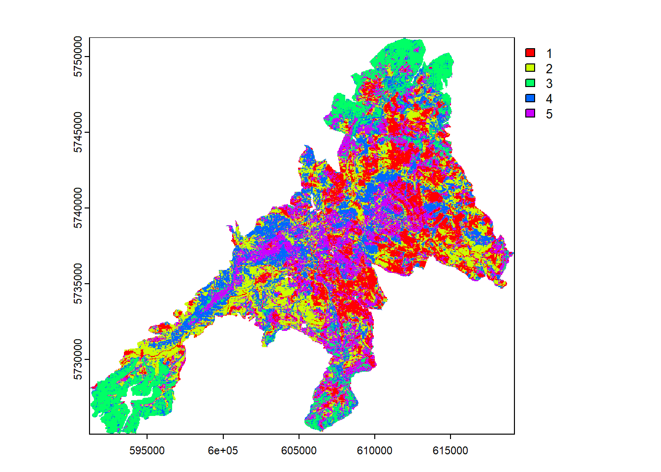
Unsupervised clustering
In the next step we run an unsupervised classification of the PC1 and PC2 to get a clustered map. For the unsupervised classification we need to take a decision on the number of classes/clusters to be created. Here we will take \(n=5\) classes. However, depending on the target variable this value need to be adjusted.
The map shows a clear spatial patterns related to the elevation, tree species and vitality status of the National Park forests.
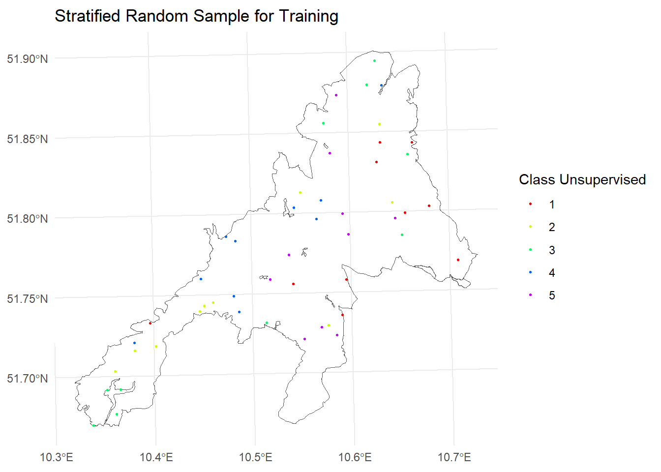
Create a stratified sample
In the next step we take a stratified random sample with \(n=10\) points from each of the 5 spectral classes.
# Draw a stratified random sample from the rastersamples <- terra::spatSample(cluster$map, size=10, method ="stratified",na.rm =TRUE, xy =TRUE, cells =TRUE)# convert to sf objectsf_samples <- sf::st_as_sf(as.data.frame(samples), coords =c("x", "y"),crs =25832)# convert the classes to factorssf_samples$class_unsupervised <-as.factor(sf_samples$class_unsupervised)# Show map using ggplotggplot()+geom_sf(data = np_boundary,fill=NA)+geom_sf(data = sf_samples,aes(color =as.factor(class_unsupervised)), size =0.5) +scale_color_manual(values =rainbow(5), name ="Class Unsupervised") +ggtitle("Stratified Random Sample for Training") +theme_minimal()+coord_sf(crs =st_crs(25832))
We can now print the sample plot list as following:
To extract pixel values for the sample location we need to define a plot design. For this exercise we will simulate a circular fixed area plot with a radius of 13 m.
# Create a training by extracting the mean value of all pixels touching# a buffered area with 13m around the plot centerplots <- sf::st_buffer(sf_samples,dist =13)train<-terra::extract(s2,plots,fun='mean',bind=FALSE,na.rm=TRUE)plots <- plots %>%mutate(ID=row_number())train <- plots %>%left_join(train, by="ID")mapview::mapview(train, zcol="class_unsupervised",map.types =c("Esri.WorldShadedRelief", "OpenStreetMap.DE"))+mapview(np_boundary,alpha.regions =0.2, aplha =1)
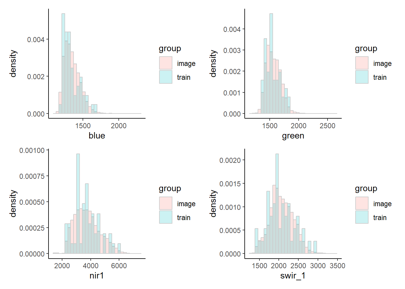
Compare the pixel value range between the sample and the image
One of the objectives of the stratified sampling with in the spectral clusters, was to ensure that we cover the spectral range of the target areas with our sample plots. By comparing the spectral distributions in the area and sample we can check if this was successful.